newton house gin
how do we create a sense of place for newton gin?
-
The Brief
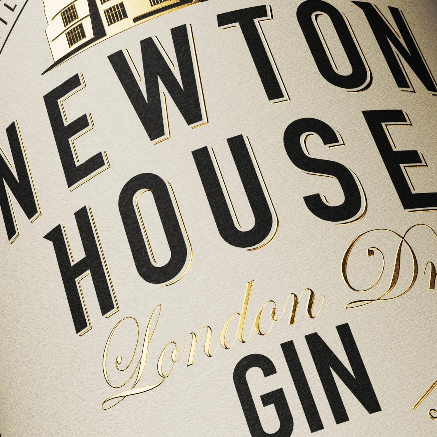
Newton Gin hails from sunny Somerset, distilled, bottled, and labeled on the grounds of the lovingly restored Newton House. The brief was to ground the gin with provenance and history, whilst retaining the premium, handcrafted qualities that the brand was known for.
Our Approach
In developing the new visual identity for Newton Gin, we knew we had to capture the rich heritage and unique character of Newton House, the question was, which part and how? During our research, the details of the house stood out, particularly a stunning decorative ceiling created in the 1800s. This intricate design became the cornerstone of our creative process.
Inspired by this historical ceiling, we developed a double-layered emboss pattern to envelop the branding. This technique not only added a tactile element to the packaging but also highlighted the craftsmanship and attention to detail that goes into each bottle of Newton Gin. The embossing pattern serves as a visual representation of the gin's heritage, creating a direct link between the product and its place of origin.
To further emphasise the handcrafted nature of Newton Gin, the branding elements are deliberately kept clean and simple, allowing the intricate embossing and house illustration to take centre stage. This balance ensures that the packaging is both eye-catching and reflective of the premium quality of the gin.
Brand Creation, Illustration, Packaging Design, Print Artwork