ecover rebrand / brand refresh
how can we restore ecover’s original eco warrior spirit?
-
The Brief
Born in 1979, Ecover was a true pioneer. Bucking the trends and breaking the mould, it sought to change the category and the world for the better.
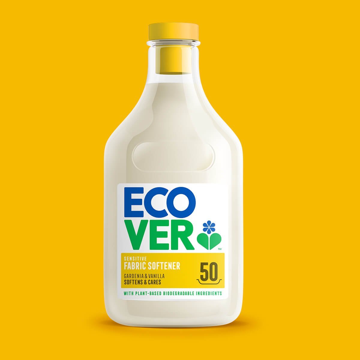
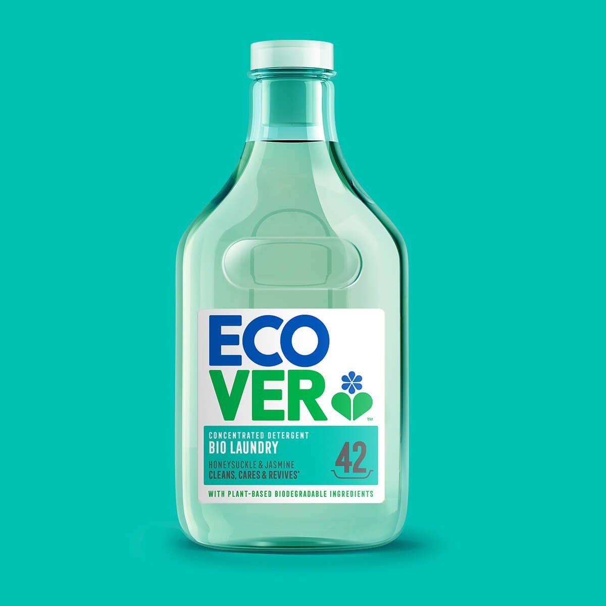
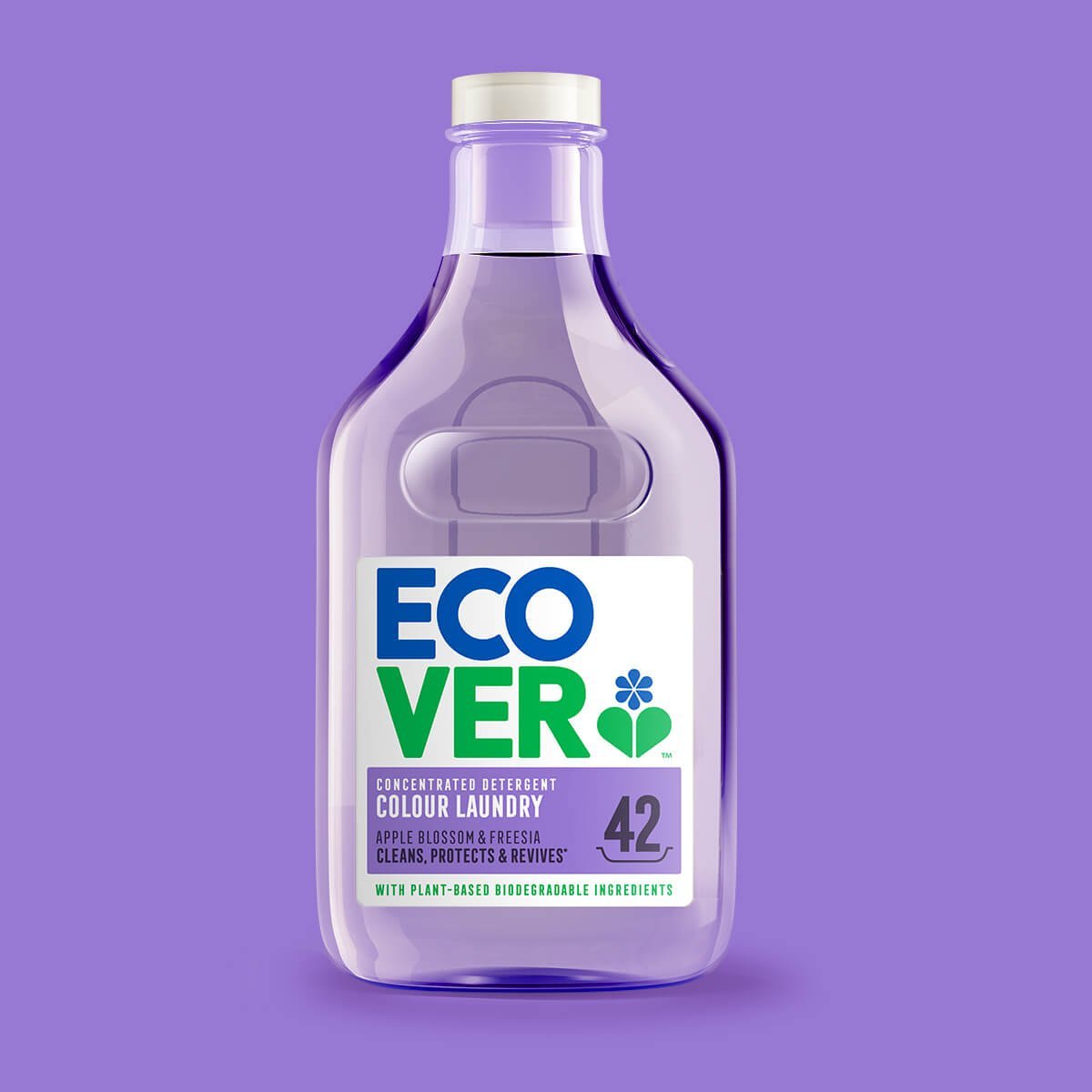
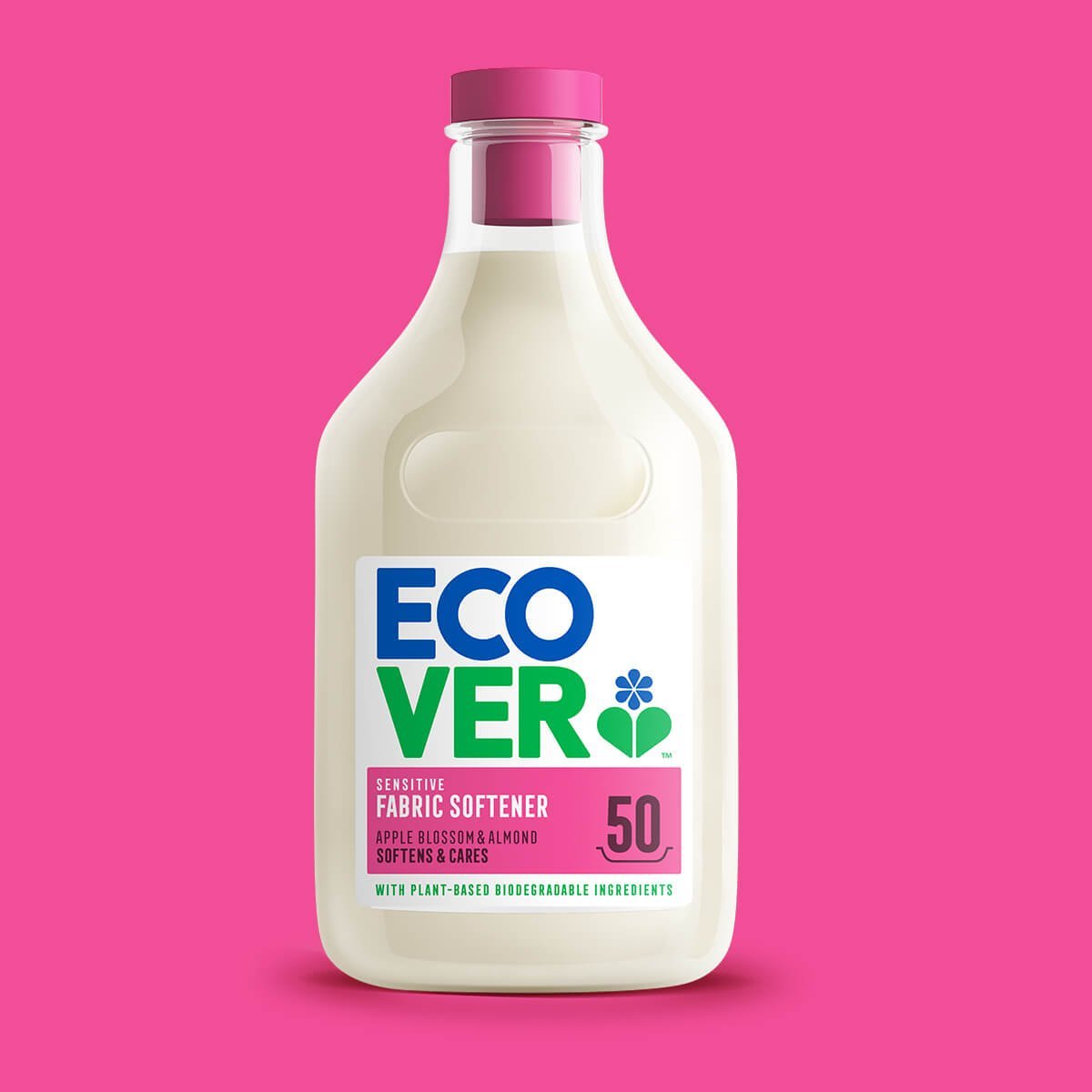
Over the decades, the brand has gone from strength to strength, but recently the packaging seemed to have lost its identity and was blending into the fixture. Our brief was to bring the brand back to its truth, capture its spirit and create cut through on shelf.
Our Approach
Our approach was simple. We needed to be honest with Ecover and its heritage. This was a bold & confident brand that did things differently, not blend with the norm. Under the strategic platform ‘Boldly transparent, defiantly clean’, we rebuilt the brand from the ground up. Ditching category cliches and traditional efficacy cues and adopting a confident brand mark, proud of its eco credentials and a pared back architecture to cut through the clutter. Even the structure delivered transparency, literally! You can see the liquid through it.
Brand Creation, Illustration, Packaging Design, Print Artwork


