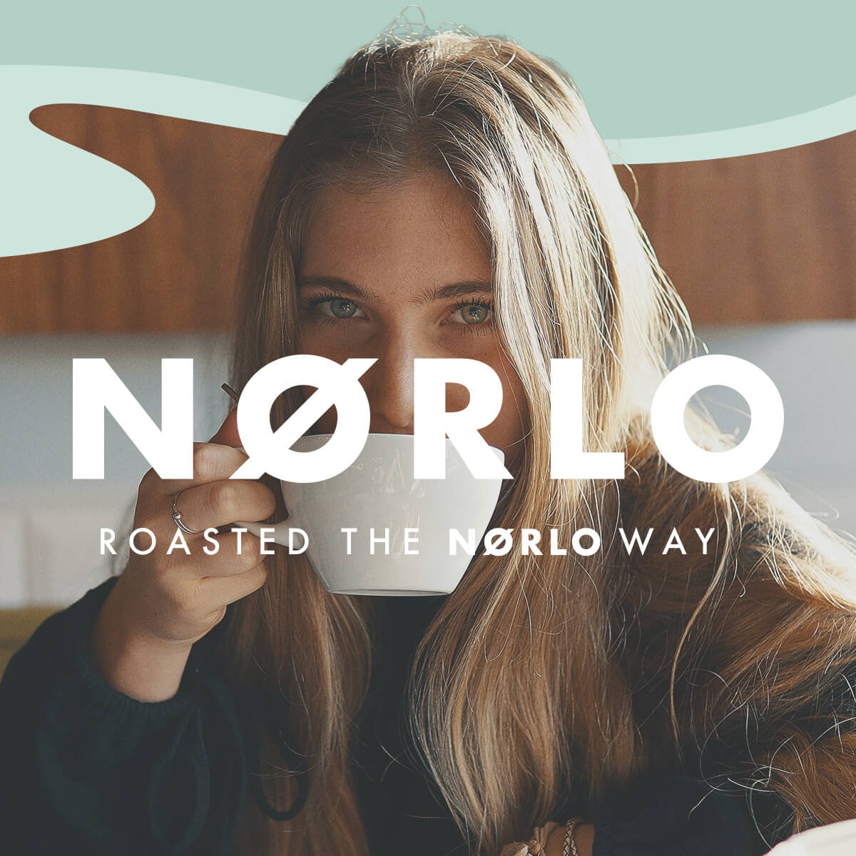
nørlo coffee / brand creation
How to launch a brand breaking coffee conventions?
-
The Brief
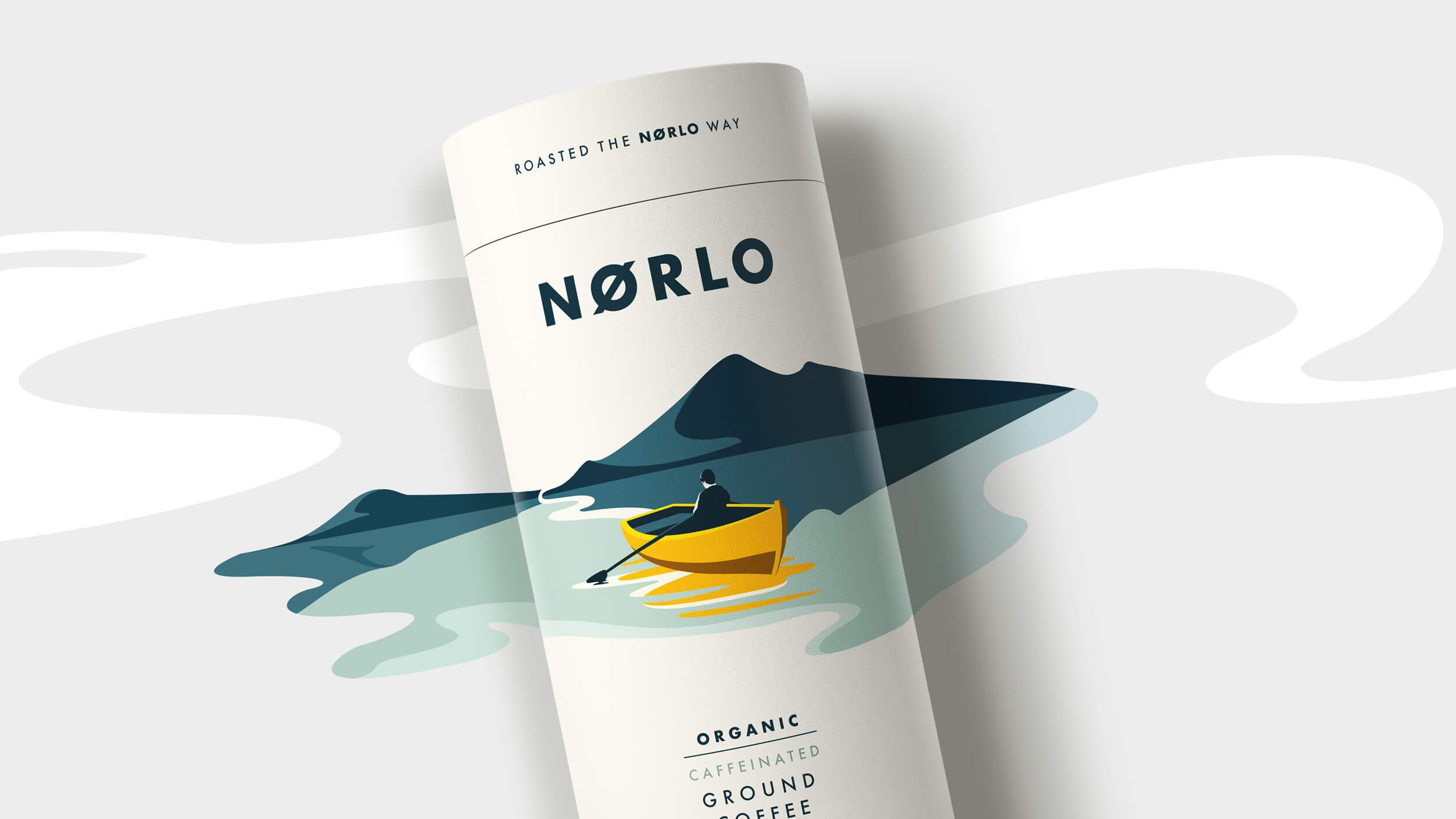
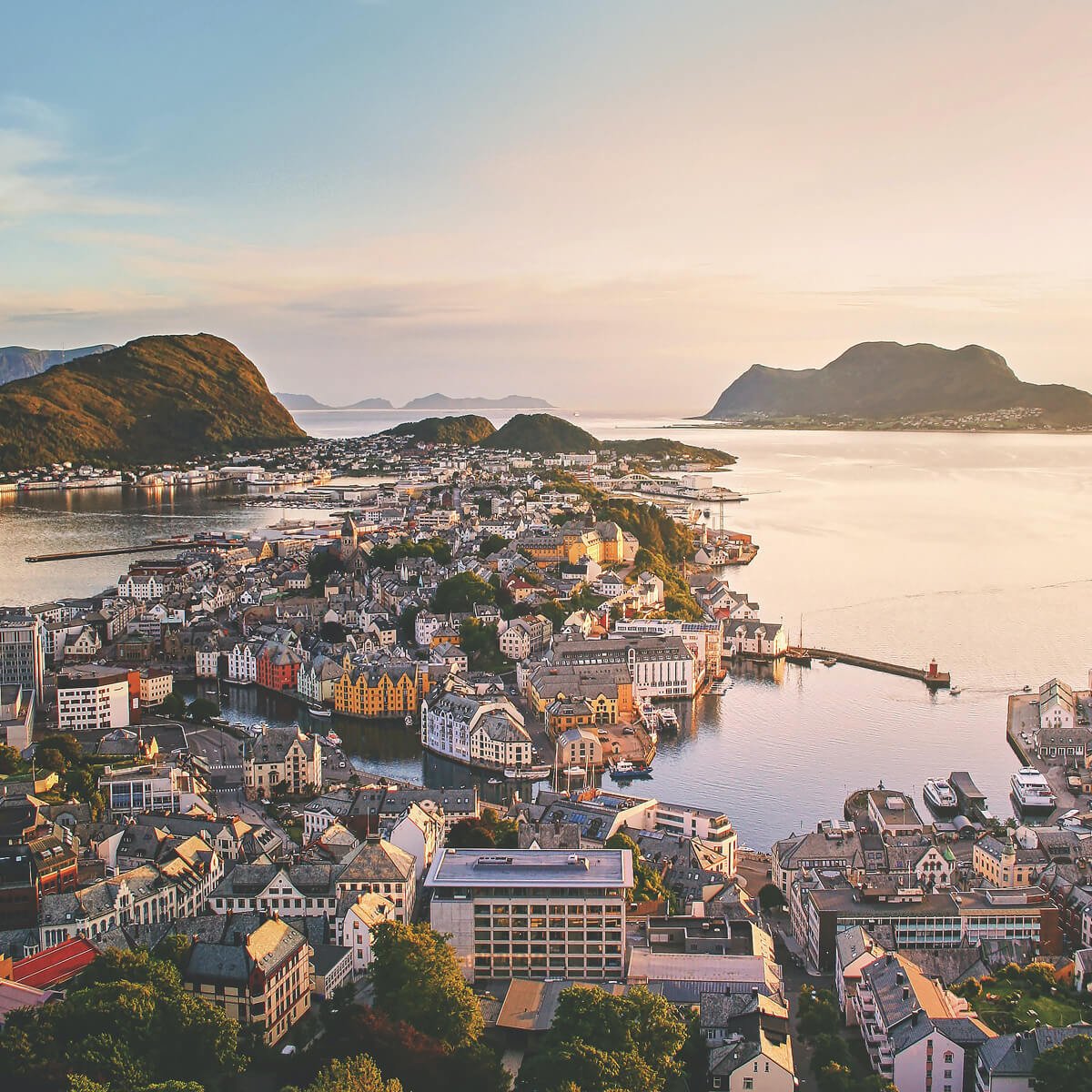
Having been inspired by the Norwegian coffee culture and the lighter roast of coffee common there, the founders briefed us to define and create a stand-alone coffee brand that expressed both provenance and process, whilst also looking premium and standing out on shelf in the UK. Coffee in Oslo, and most of Scandinavia is smoother and lighter and drunk all day every day!
Our Approach
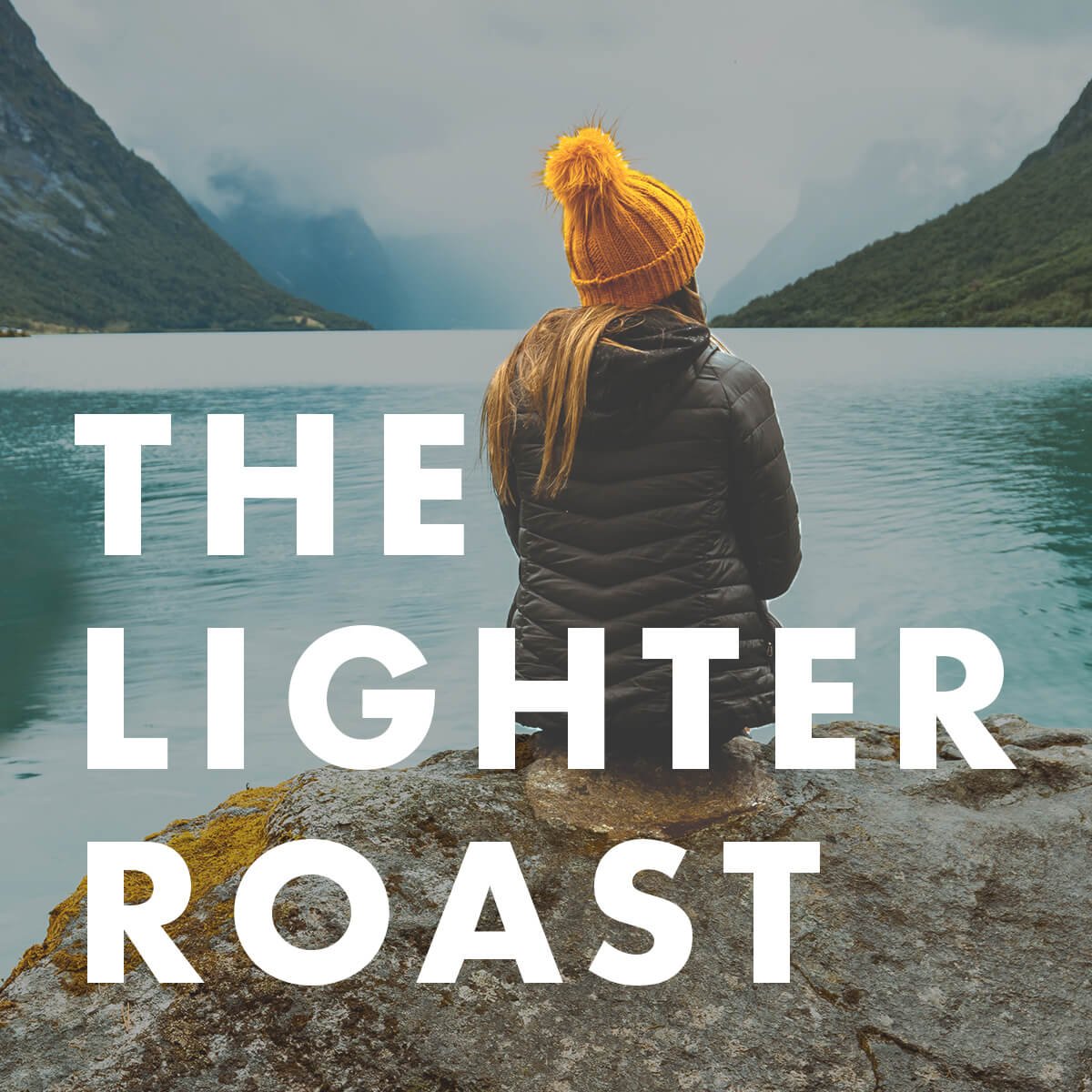
Staying true to the lighter roast of the product, and taking inspiration from the outdoorsy Scandinavian lifestyle, we knew we could differentiate the brand from other mainstream competitors and carve out shelf space in a retail aisle crowded with dark, rich coffee varieties.
In line with the clean, minimalist Scandinavian aesthetic, we developed a range of bespoke illustration vistas that reimagined traditional coffee imagery to turn the conventional coffee category on its head.With a striking pop of yellow and the sensorial aroma cues subtly interpreted through the illustrations, the designs evoke the natural beauty and tranquility of Scandinavia, which creates great cut through on the crowded shelf.
Smoother, lighter, brighter - the Nørlo way.
Brand Creation, Illustration, Packaging Design, Print Artwork
