boka foods / brand creation
how do we signpost better, healthier cereal bars?
-
The Brief
Boka Foods were widely stocked but were struggling to stand out in an increasingly busy category. The products themselves boast 100% green traffic lights for health metrics, but this wasn't being effectively communicated on or off the packaging. We were tasked with developing a new brand positioning and pack redesign to give the brand a renewed focus and making it fun enough for kids and trustworthy enough for adults.
Our Approach
We recognised that people are increasingly (and rightly!) skeptical about what is hidden in their "healthy" food. To address this, we developed a new positioning based on the idea of starting an "Honest Conversation." This concept aimed to build trust with consumers by highlighting the transparency and straightforwardness of Boka Foods' ingredients and nutritional benefits.
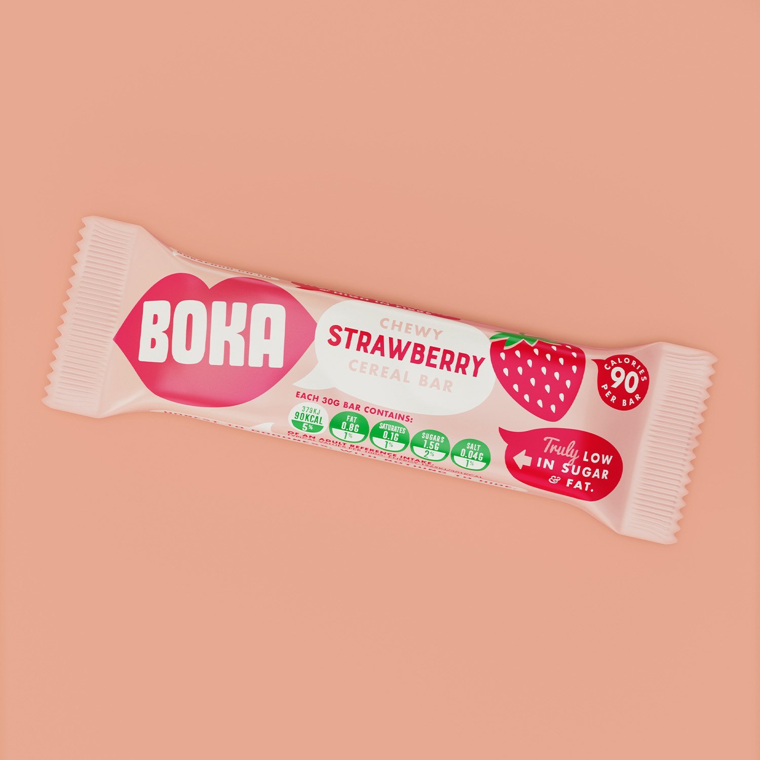
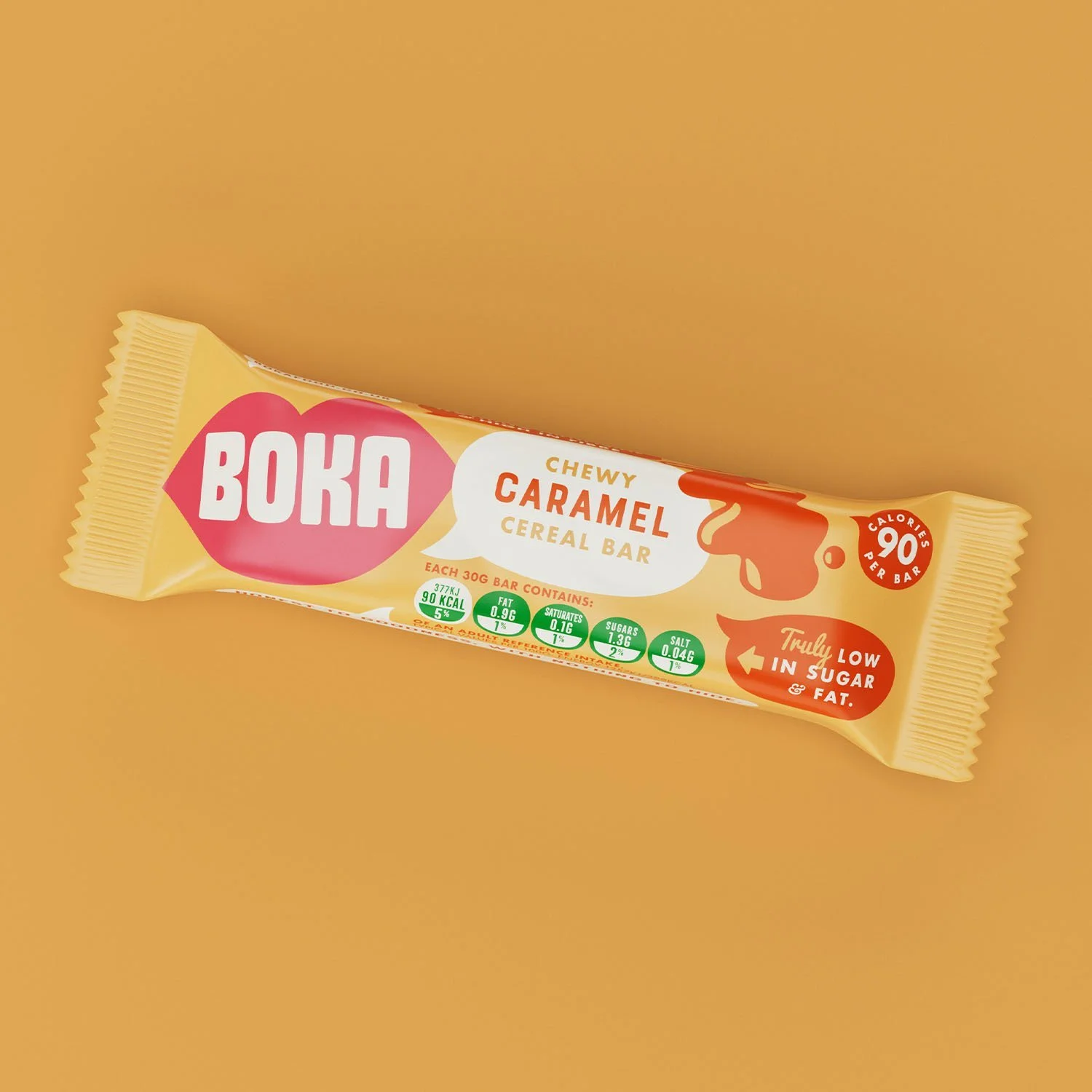
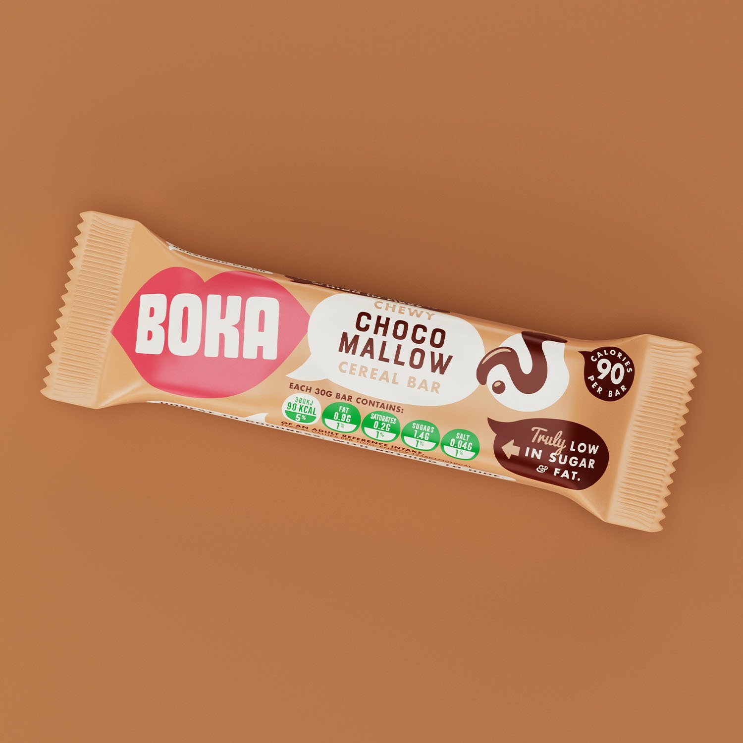
The name "Boka," which means mouth in Italian, provided a unique opportunity to link the brand's name with its product USPs. We injected a fresh and modern illustrative packaging style and suite of brand elements that amplify the brand's talking points both on and off the pack. This visual identity was designed to be engaging and approachable, making it easy for consumers to understand and trust the brand's health claims.
We focused on clean, bold graphics that clearly displayed the 100% green traffic lights, ensuring that this key selling point was immediately visible. The use of bright, vibrant colours and playful illustrations helped to convey the brand's commitment to honest, healthy eating in a fun and accessible way.
Additionally, we incorporated messaging that reinforced the brand's transparency and commitment to quality. This included clear, concise information about the ingredients and their benefits, as well as the brand's overall philosophy of honest communication.
Through this comprehensive redesign, we were able to give Boka Foods a strong, distinct identity that resonates with health-conscious consumers. The new packaging not only stands out on the shelves but also effectively communicates the brand's core values and health benefits, helping Boka Foods to regain its competitive edge in the market.
Brand Creation, Illustration, Packaging Design, Print Artwork


