hartridges / brand redesign
how do we honour tradition while embracing modernity?
-
The Brief
To reinvent the visual identity of Hartridges, the UK’s oldest independent soft drink company. With a rich heritage dating back to 1882 and still family-owned (Ed Hartridge is the 5th generation owner!), the objective was to create a fresh, contemporary look that celebrates the brand's storied past while appealing to modern consumers. The new design needed to stand out in a competitive market and reflect the natural, high-quality ingredients of Hartridges' beverages.
Our Approach
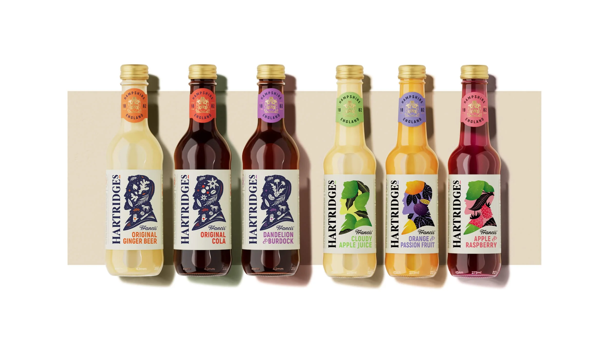
Drawing inspiration from Hartridges' rich history and commitment to quality, we crafted a design to bridge the past and the present. The packaging features a distinctive silhouette of the brand's founder, Francis Hartridge, adorned with bespoke illustrations that symbolise the core values and natural ingredients of the drinks.
To ensure the packaging resonates with contemporary consumers, we opted for a vibrant yet elegant colour palette, coded by flavour to ensure the range is easily recognisable on the shelf, and importantly in the fridge behind the bar in the pub.
The detailed illustrations on the labels tell the story of the natural ingredients used in the drinks. They’re a distinctive asset in their own right and blend traditional craftsmanship with a fresh, current aesthetic. Furthermore, the tessellated pattern created by the consistent silhouette across the range ensures strong brand blocking on shelves, making Hartridges unmistakable among its competitors. The use of gold foil on the neck labels adds a touch of sophistication and highlights the premium nature of the beverages.
Hartridges: Family / Perseverance / Partnership / Flavour
Brand Creation, Illustration, Packaging Design, Print Artwork