tempus two / brand redesign
how do we go beyond tradition to redefine wine?
-
The Brief
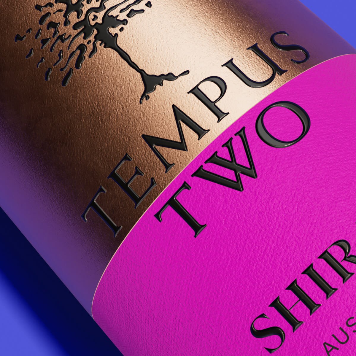
Tempus Two is one of Australia’s bestsellers and believes that wine shouldn’t be so difficult. Our brief was to rebrand Tempus Two's Quartz range to reach a new audience, less confined by ‘old world’ wine traditions. We needed to highlight the brand's innovative spirit and ensure standout shelf presence.
Our Approach
We knew that the desired audience needed more boldness and colour and for shelf stand out we wanted to keep it fairly pared back. The spirit of the brand is all about simplicity, rebellion and ‘kiss my glass’ attitude… and this needed to be captured. The final design is clean, utilising flat, bold and bright colour blocks, combined with sleek typography and incorporating the brand's iconic tree emblem to symbolise its rich variety and heritage.
The rebrand invites wine lovers to embrace a brand that stands for uniqueness and celebration, echoing the ethos of going "beyond tradition.”
Tempus Two - #dowineyourway
Brand Creation, Illustration, Packaging Design, Print Artwork