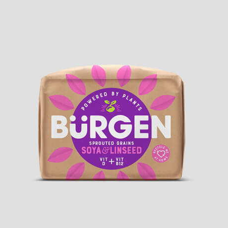
BURGEN - ALLIED BAKERIES
Brand Refresh / Packaging Design
The Brief
Burgen was struggling to cut through amongst the saturated seeded bread category and needed a new reason to be in order to redefine itself as the pioneer of healthy seeded bread.
We were tasked with re-positioning Burgen, to support an increase in volume growth and help communicate a new product offering
Our Approach
As an already established brand we needed to be respectful of Burgen’s past and so developed a new look that not only felt both fresh and bold but also one of familiarity. Under our new brand positioning of ‘Plant Power Positivity’ we reignited Burgen as the catalyst of both taste and health. The windowless Kraft bag allowed us to dial up the Eco credentials whilst the new modern visual articulation gave the brand a vibrant optimism and striking difference at fixture.