Plant POPS
Brand Development / Packaging Design
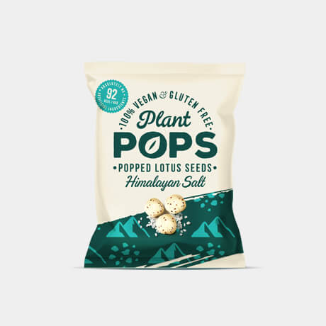
The Brief
Plant Pops approached Design Happy to create a brand look and feel for their range of flavoured, popped lotus seeds. As an alternative to existing lighter, low calorie snacks it was important that the packaging still delivered strong flavour credentials and not seen as a low taste substitute.
Our Approach
We developed a strong brand architecture that allowed us to included multiple claims without cluttering the packaging. The light cream tone played back the natural colouring of the lotus seeds whilst delivering a sense of low calorie. This was then offset with a bold flash to give the brand a modern edge.


"Design Happy went above and beyond in delivering a packaging design for our start up company. The team gave us such an array of concepts to choose from, with so much thought, detail and skill in every design. They were there every step of the way and worked at pace to create a final design we couldn't be happier with. We are so excited to work with them on the other projects we have planned!"
ANUSHI DESAI (FOUNDER, PLANT POPS)

OTHER PROJECTS